For an increasing majority of us, our mobile devices are the last things we touch before we go to bed at night and the first things we pick up and check when we wake up. Now more than ever, people are using their mobile devices to not only make phone calls and send text messages, but to access information on the Internet. According to the Pew Internet & American Life Project, the majority of American adults who have cell phones are now using them to go online. Within that surveyed group, nearly one third of those adults use their phones for the majority of their Internet access. Also important to note, it is projected that smartphones and tablets sales will gradually increase over the next few years, while sales of computers (PCs and laptops) are expected to remain stagnant. So, the question is, is your website changing wit this mobile revolution, or is it remaining stagnant?
Personally, my iPhone is faithfully relied upon as a main conduit for information, especially when I’m on the move. I’ll Google a place to eat, or an address for a destination I was going to. I cannot begin to tell you the number of times I’ve attempted to access a website online, and because of glaring functionality and usability issues, have gone back to the search results and have gave my business to a competitor site that I was able to use on my mobile device with.
Because of the clear direction the market is going, it is becoming increasingly important that businesses consider what users are seeing when they access their site from a smartphone or tablet.
So, what exactly makes a website “mobile-friendly” or “mobile-unfriendly”
Here are a few key items:
- Fast page load time
- Large mobile-friendly buttons and navigation that can be easily accessed by a touch of a finger tip
- A phone number with a “click to call” option so a phone call can be made without redialing
- An address that can be clicked and automatically pull directions
- Easily-accessible search bar
- A navigation with tabs to information that makes the most sense for mobile users
- Will fit in the screen without (or minimal) scrolling
Below you can see a few of the key ways that a mobile and regular website should differ:


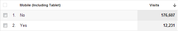
Google Analytics is a great tool to use to determine if your website is a culprit of poor functionality and usability when being accessed by a smartphone or tablet. Not only can Google Analytics be used to see how much mobile traffic your website receives and from what types of devices, but it can also provide insight into the type of experience, whether it be negative or positive, these visitors had on your site.
With “In-Page Analytics,” you can see behavior using a small screen browser to see what your site looks like on a mobile screen.
You can also analyze bounce rate and number of page views to see how visitors are using your regular website compared with how they interact with it on a mobile device. If the bounce rate is higher for mobile users with less page views, this could indicate a poor usability rate.
There are also a number of free resources, such as this mobile web optimization and best practices guide.
If you already have the budget or you have the skills to do create a mobile site, there exist fewer excuses not to have one. At the least, every business should know their website mobile usage stats and how their site appears on mobile devices.


